Designing a compelling employee portal in SharePoint Online shouldn’t require months of custom development. The Modern Intranet Kit is a professional-grade suite of SharePoint Framework (SPFx) web parts that transforms your intranet into a high-engagement, modern workplace — deployed from a single .sppkg file.
In this post, I’ll walk through the solution architecture, the underlying toolchain, and provide a detailed breakdown of all 10 web parts included in the suite — from a Solutions Architect perspective.
Solution Overview
The Modern Intranet Kit is a modular branding and functionality suite that empowers organisations to design unique, engaging layouts in SharePoint Online. By deploying a single solution package, the entire kit is installed at once, instantly providing your team with multiple premium tools available in the web part picker.
Core Value Pillars
The solution is built around five foundational design principles that address the most common intranet challenges I see in enterprise environments:
Flexible Modern Layouts — Build a personalised experience by choosing the right web parts for your communication strategy. Each web part is designed to work independently or as part of a cohesive page layout.
Single Solution Deployment — One .sppkg file installs the entire suite. No need for multiple app catalog entries, multiple deployments, or fragmented governance. This simplifies your ALM (Application Lifecycle Management) story significantly.
Native Theming — Every component automatically inherits the SharePoint site theme for seamless branding. No manual colour overrides needed — change your site theme and the web parts follow.
Cross-Site Connectivity — Easily pull and aggregate data from any list across your tenant. This is critical for hub-site architectures where content lives in different site collections but needs to surface centrally.
Intelligent Prioritisation — Built-in logic for “Pinned” and “Active” statuses allows editors to promote high-value content without needing technical expertise.
Toolchain and Technical Foundation
From an architecture standpoint, the technology choices here reflect current best practice for enterprise SPFx development. The solution is built on modern web standards to ensure performance, security, and long-term maintainability.
| Component | Technology |
|---|---|
| Framework | SharePoint Framework (SPFx) 1.22.0 |
| Language | TypeScript (~5.8.0) and React (17.0.1) |
| UI Toolkit | Fluent UI React (@fluentui/react ^8.106.4) |
| Build Tooling | Node.js (>= 22.14.0 < 23.0.0), Rush Stack Heft 1.1.2, Webpack |
| Data Layer | SharePoint REST API (spHttpClient) and Microsoft Graph API |
| Styling | Vanilla CSS with localised SCSS Modules and CSS Custom Properties for theme inheritance |
| Architecture | Shared SiteListService and ThemeService for unified data and visual logic |
| Security | 100% CSP compliance, zero external dependencies, native SharePoint and Graph authentication |
A few architectural decisions worth highlighting for fellow Solutions Architects:
The shared SiteListService pattern means all web parts use a common data-access layer. This reduces code duplication, simplifies testing, and ensures consistent error handling across the entire suite. The ThemeService similarly centralises visual logic, ensuring that any theme change propagates uniformly.
The zero external dependency approach is particularly important for organisations with strict Content Security Policy (CSP) requirements. There are no CDN calls, no third-party scripts — everything runs within the SharePoint context.
Web Part Catalog: All 10 Components
Below is a detailed breakdown of each web part, its purpose, key features, and the configuration properties available to site authors.
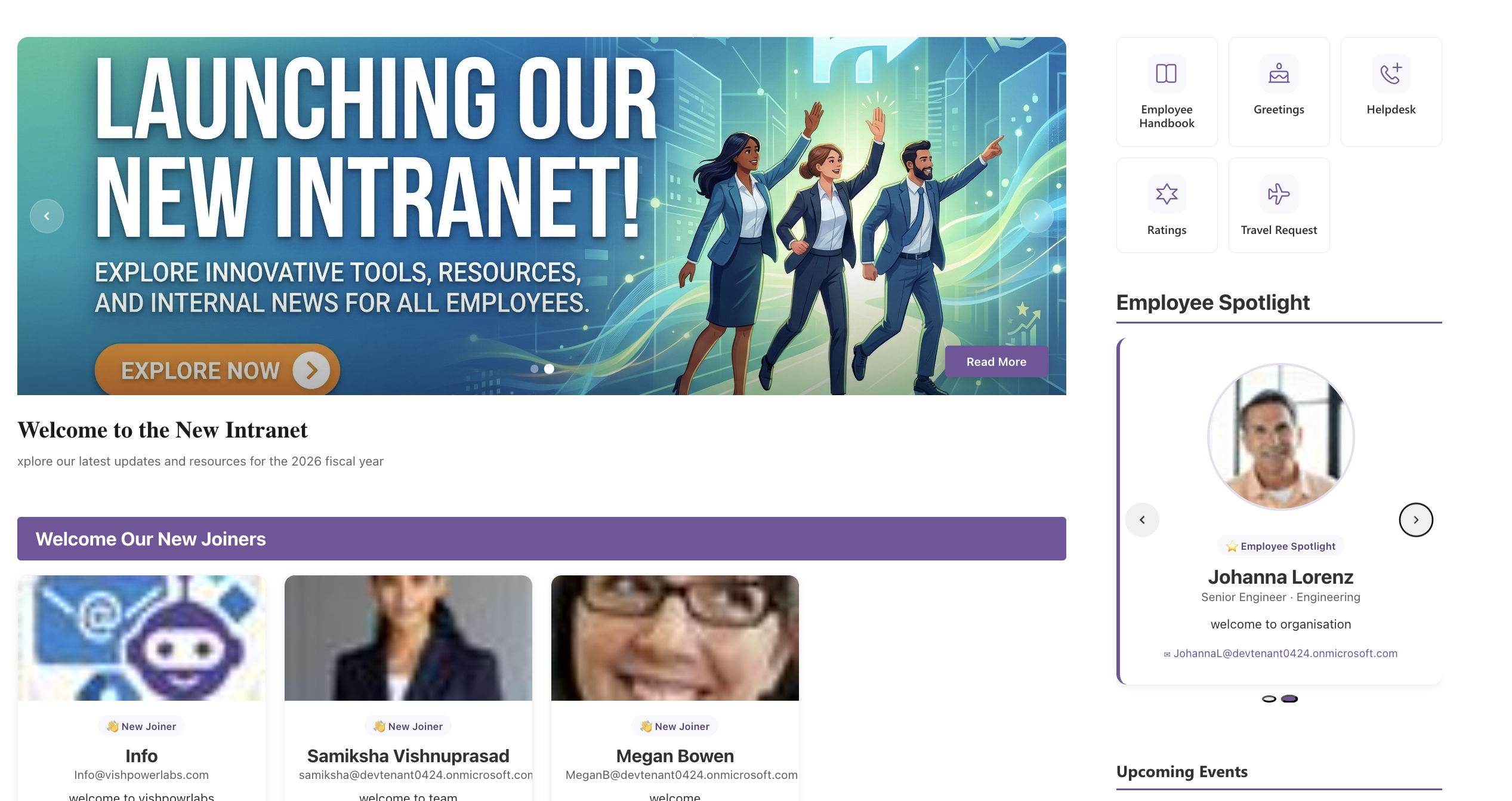
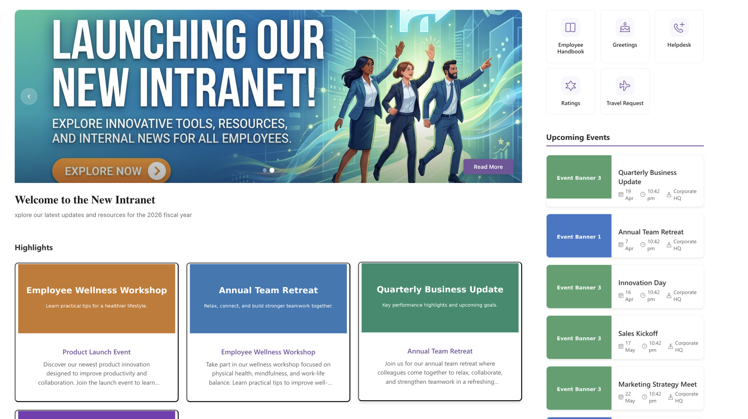
1. Banner Slider
High-impact visual communication for the top of your homepage.
The Banner Slider is a full-width, auto-rotating image carousel designed for featured news and strategic announcements. It supports auto-rotation intervals between 3 and 10 seconds with hover-to-pause logic, glassmorphism overlays for text readability, dynamic calls-to-action, and “Active” status filtering so editors can control which slides appear without deleting list items.
Configuration: Data Source (siteUrl, listId), Field Mapping (title, description, image, active, buttonText, pageLink), Settings (autoRotateInterval, showCta, showTitle), and Styling (titleBarStyle).
2. Events
A clean, organised way to display what’s happening in your organisation.
The Events web part provides a multi-column grid layout for upcoming engagement opportunities and corporate events. It supports flexible grid density (2, 3, or 4 columns), chronological intelligence that automatically hides past events, priority “pinning” for featured events, and an optional “View All” link to a dedicated events page.
Configuration: Data Source (siteUrl, listId), Field Mapping (title, date, image, link, location, active, pinned), Layout (maxItems, itemsPerRow), and Action (showViewAll, viewAllUrl).
3. Highlights
Modular content cards for news, initiatives, or spotlights.
Highlights delivers a card-based grid featuring rich imagery, clear titles, and descriptive text snippets. It uses pre-optimised thumbnails leveraging SharePoint Image columns, supports priority/pinned item sorting, and offers synchronised header styling consistent with the rest of the suite.
Configuration: Field Mapping (title, description, bannerImage, link, pinned), Display (maxItems, columns 2 or 3), and Branding (showTitle, showBackgroundBar, titleBarStyle).
Screenshots
Here’s a look at the Modern Intranet Kit web parts in action. Each screenshot demonstrates the web parts configured on a live SharePoint Online communication site using the default site theme.
4. Quick Links
Streamlined navigation tiles for your most-used resources.
Quick Links provides a minimalist grid of shortcut tiles with icons and labels for efficient information access. It supports high-density layouts with up to 6 tiles per row, Fluent UI icon integration for a native Microsoft 365 look, and smart internal/external navigation handling.
Configuration: Field Mapping (title, link, icon, pinned), Layout (columnsPerRow), and UX (openInNewTab).
5. Document Viewer
A centralised hub for navigating organisational files and resources.
The Document Viewer is a multi-level document explorer featuring category-based navigation, sub-category filtering, and integrated search. It offers dual-level navigation, a choice between Side Navigation and Top Tabs display modes, seamless SharePoint Web Viewer (?web=1) integration for in-browser document previews, and instant real-time search.
Configuration: Field Mapping (categoryField, subCategoryField, descriptionField, pinnedField), Logic (enableSubCategory, categoryDisplayType), and Styling (pageSize, font sizes).
6. Calendar
A unified hub for managing your organisational schedule.
The Calendar web part is a feature-rich calendar supporting Day, Week, Month, and Year views. It integrates natively with SharePoint Events lists, offers yearly grid or timeline modes, includes a live current-time indicator, and provides clean contextual overlays for event details.
Configuration: Field Mapping (title, startDate, endDate, location), Settings (defaultView, yearViewType), and Branding (showTitle, showBackgroundBar, titleBarStyle).
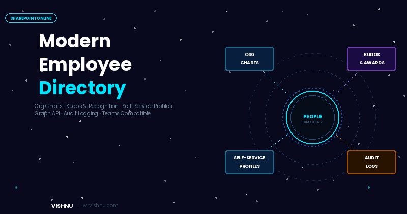
7. Employee Directory
A dynamic, searchable directory for finding and connecting with colleagues.
The Employee Directory is a comprehensive employee catalogue supporting both Microsoft Entra ID (via Graph API) and custom SharePoint Lists as data sources. It includes profile enrichment fields (About Me, Skills, etc.), List/Grid view toggling, and smart filtering by Department and Location.
Configuration: Source selection (Graph vs SharePoint List), full attribute mapping, and UI settings (viewMode, pageSize, showFilters, showPagination).
8. Employee Spotlight
Recognise and highlight exceptional team members.
Employee Spotlight provides a dynamic showcase for spotlighting specific employees via rich cards or an auto-rotating carousel. It features Microsoft Graph People Picker integration for manual selection, Standard/Compact layout modes, and custom write-ups per person.
Configuration: Source (SP List vs Manual), Manual selection (selectedUsers, commonDescription), Automation (autoRotateInterval, maxItems), and Styling (layoutMode, titleBarStyle).
9. New Joiners
A warm welcome for your organisation’s newest members.
The New Joiners web part is a visually engaging slider or grid that highlights recent hires, featuring photos and welcome messages. It includes a dedicated horizontal “Strip” mode ideal for sidebars, manual curation via Graph People Picker, and customised welcome messages per joiner.
Configuration: Source selection, Field Mapping (name, photo, jobTitle, department, newJoinerText), Layout (List/Grid/Strip, layout mode), and Settings (maxItems).
10. FAQ
Accordion-style information hub with search and filtering.
The FAQ web part is a performance-optimised component featuring category filtering and real-time search. It supports instant client-side search, dynamic category pills for filtering, Single/Multi expand modes, and ordered content sorting.
Configuration: Field Mapping (question, answer, category, order), Settings (showSearch, showCategoryFilter, allowMultipleOpen, expandFirstItem), and Branding (showTitle, titleBarStyle).
Architecture Considerations for Deployment
Before deploying the Modern Intranet Kit across your tenant, there are a few architectural considerations worth planning for:
App Catalog strategy — Decide whether to deploy to the tenant-level App Catalog (organisation-wide availability) or a site-level App Catalog (scoped to specific site collections). For most intranet scenarios, tenant-level deployment is the right choice.
Permissions model — Since the solution uses both the SharePoint REST API and Microsoft Graph API, review the API permissions requested in the solution manifest. Graph permissions (for Employee Directory, Spotlight, and New Joiners) require tenant admin approval.
List provisioning — Each web part expects a backing SharePoint list with specific columns. Plan your information architecture upfront — decide which site collection will host the source lists, and whether you’ll use a centralised “Intranet Data” site or distribute lists across hub sites.
Governance — The cross-site connectivity feature is powerful but needs guardrails. Establish clear ownership for each source list and document the siteUrl / listId mappings used across your pages.
Conclusion
The Modern Intranet Kit standardises the intranet experience with robust, professional configurations while putting immense control into the hands of site authors. The common branding elements, standardised loading states, and tight SharePoint/Graph integration create a cohesive digital workplace foundation that scales across your organisation.
As a Solutions Architect, what I appreciate most about this approach is the single-deployment model combined with the shared service architecture. It dramatically reduces the ALM overhead compared to deploying 10 individual web parts, while still giving site owners the flexibility to compose pages that suit their audience.
Source Code
The complete source code for the Modern Intranet Kit is available on GitHub. You can clone the repository, review the architecture, and customise the web parts to suit your organisation’s requirements.
View the Modern Intranet Kit on GitHub
The repository also includes PowerShell scripts (.ps1) to get you up and running quickly. Look for these in the repo to automate the two most time-consuming setup tasks:
List Creation Script — Provisions all the required SharePoint lists and columns for each web part. Rather than manually creating lists and configuring column types one by one, run this script against your target site collection to set up the complete data structure in minutes.
Sample Data Loading Script — Populates the newly created lists with demo data so you can see every web part working immediately after deployment. This is invaluable for proof-of-concept environments, sandbox testing, and stakeholder demos.
Contributions, issues, and feature requests are welcome. If you’ve extended or customised any of the web parts for your environment, I’d love to hear about it — drop a comment below or reach out via