Managing user guides, process documents, and reference files across an organisation often ends up scattered across email threads, Teams chats, and forgotten SharePoint folders. In this post I want to share a simple but useful Power Apps document library sample that pulls files directly from a SharePoint Online document library and presents them in a clean, themed, category-driven interface that anyone in the organisation can use.
What makes this Power Apps document library sample particularly worth studying is not just the document listing itself, but the way theming and font management are centralised through global variables. Change one variable and the entire app re-skins instantly — no need to hunt through every label, button, and table cell to update colours or font sizes. This is a pattern every Power Apps maker should adopt early.
This sample is part of my ongoing series on practical Microsoft 365 solutions, and the full source code is available on GitHub for you to fork and adapt.
Most organisations already store documents in SharePoint Online, but the out-of-the-box library experience is not always the friendliest for end users. Staff often just want to find the right user guide or process document, click, and download. They do not want to navigate folders, filter views, or learn SharePoint metadata.
A lightweight Power Apps front-end solves exactly this problem. It gives you:
A focused interface that hides SharePoint complexity
Category and sub-category navigation that mirrors how staff actually think
One-click downloads for any document
A consistent look and feel that you control through themes
A central place where governance, permissions, and versioning still live in SharePoint
How the Power Apps Document Library Sample Works
The sample is built around a single SharePoint Online document library called User_Guide_Lib. The library uses two choice columns, Category and SubCategory, alongside the standard Title, Description, and File columns. These two columns drive the entire navigation experience inside Power Apps.
SharePoint Document Library Setup
The document library is a standard SharePoint Online document library with the following columns added:
Title – Single line of text
Description – Multiple lines of text
Category – Choice (e.g. Teams, SharePoint)
SubCategory – Choice (e.g. Sample, Process)
FileDescription – Multiple lines of text
Pinned – Choice
Once the library is in place, create a new Canvas App in Power Apps and add the SharePoint connection pointing to User_Guide_Lib.
The App OnStart Logic
All the heavy lifting happens in the App.OnStart property. This is where the categories, sub-categories, and theme variables are loaded into collections so the rest of the app can stay fast and reactive. Here is the core of what runs at startup:
The key takeaway is that Distinct() is used to dynamically build the sub-category tab list, and Choices() pulls the category list straight from the SharePoint column definition. This means the Power Apps document library updates automatically whenever you add a new category or sub-category in SharePoint, no app republish required.
Centralised Theming and Font Management
This is the part of the sample I am most excited to share, because it solves a problem every Power Apps maker eventually runs into: “I want to change the brand colour, but now I have to open 47 controls and update them one by one.”
The whole app is themed and styled through a small set of global variables defined once in App.OnStart. Every label, button, header, tab, and table cell in the app references these variables instead of hard-coded values. Change the variable, and every control that uses it updates automatically the next time the app runs.
Font Management with Four Variables
Instead of setting font size and font family on every single control (and forgetting one, and ending up with that one rogue label in Calibri 11), the sample defines just four variables:
From this point on, every control in the app uses these variables in its Size and Font properties. For example, a heading label would be set as:
// On the label control
Size = AppHeading
Font = AppFont

// On a body text label
Size = NormalText
Font = AppFont
The benefits compound quickly:
Brand-wide font change in one line. If your organisation rebrands from Segoe UI to Inter or Lato, you change AppFont once and the entire app follows.
Consistent typography hierarchy. You cannot accidentally end up with five slightly different “heading” sizes scattered across screens, because there is only one heading variable.
Accessibility tweaks become trivial. Need to bump up the base font size for a vision-impaired audience? Change NormalText from 12 to 14 and ship.
New screens inherit the design language for free. Any new label you add just references the variables, so your app stays visually consistent as it grows.
Theme Switching Through a Single Variable
The colour theming follows the same principle, but takes it a step further. Instead of setting individual colours on every control, the sample defines a set of semantic colour variables — variables named after their role in the UI rather than the colour itself:
HeaderColor — used by the top app bar
SidebarColor — used by the left navigation panel
TabActiveColor — used by the currently selected sub-category tab
TabInactiveColor — used by unselected tabs
TableHeaderColor — used by the document table header row
HoverFillColor — used for hover and accent states
A single master variable, ThemeName, drives the whole thing. A Switch() statement maps the theme name to the right palette and assigns the six semantic variables in one go:
Because every control references the semantic variables (Fill = HeaderColor, Fill = TabActiveColor, and so on), switching the entire app from Microsoft Modern to Deep Teal is a single variable change. The dropdown at the bottom of the screen exposes this as a runtime choice for users, but you can just as easily lock it to a single corporate theme by hiding the dropdown and hardcoding ThemeName in OnStart.
Why This Pattern Matters
This is the same idea as design tokens in modern web development, or CSS custom properties: separate the meaning of a colour from its actual hex value, so that the meaning stays stable while the value can change. In Power Apps, where you cannot use a global stylesheet, this variable-based pattern is the closest equivalent — and it should be the default for any app that is going to live longer than a week or be used by more than one team.
If you take only one thing away from this sample, let it be this: never hard-code a colour, font, or font size on a control. Always reference a variable. Your future self (and anyone who inherits your app) will thank you.
The User Interface of the Power Apps Document Library
The app is built around three main screens that together give you a polished, themeable document portal.
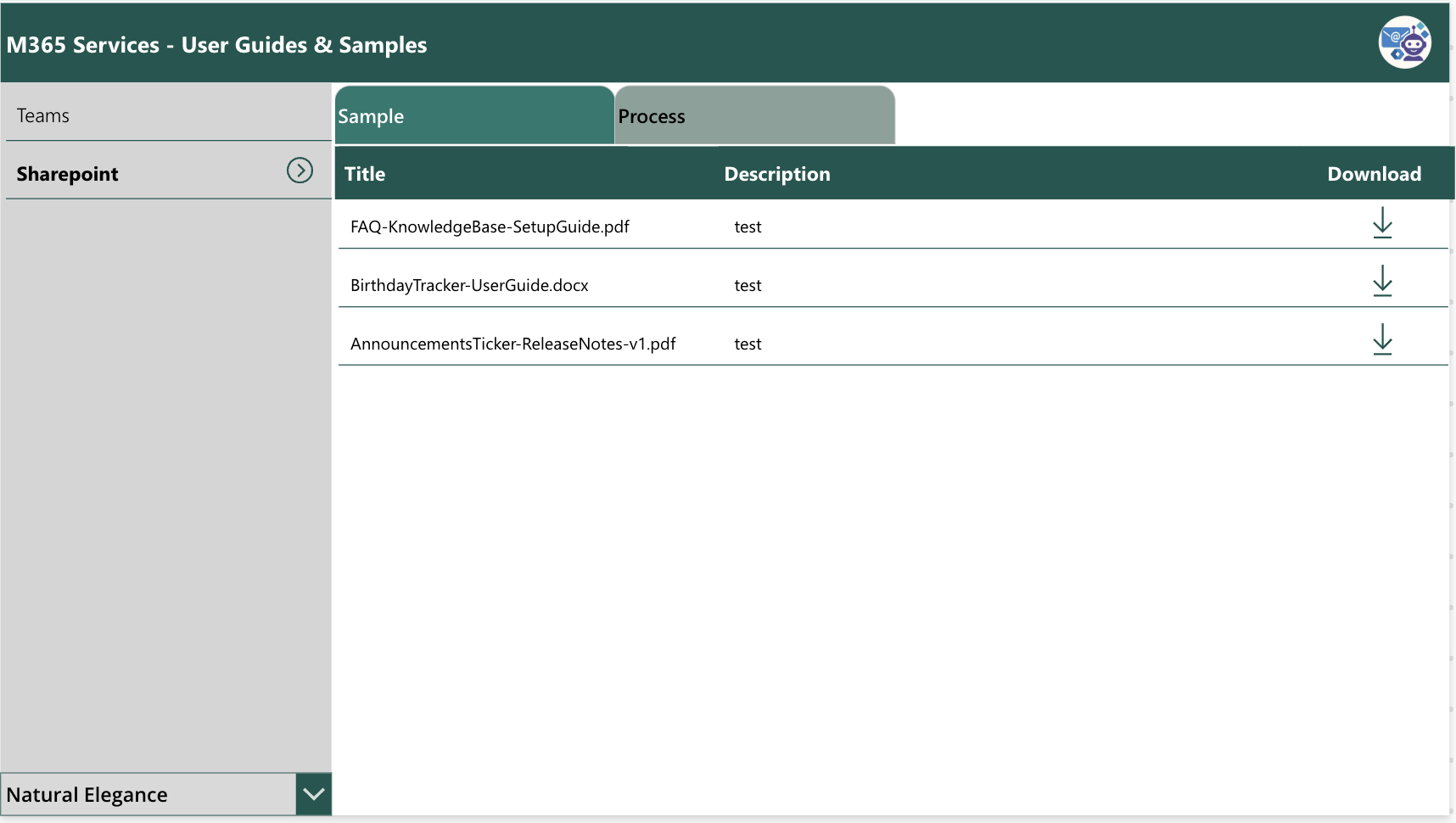
1. Main Screen
The main screen of the Power Apps document library shows the categories as a left-hand menu, sub-categories as tabs across the top, and the matching documents in a clean table with download icons. Selecting a category on the left and a sub-category tab on top filters the table instantly.
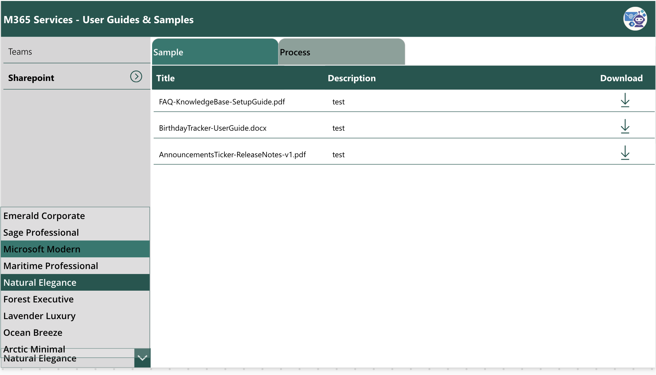
2. Theme Selection
The theme dropdown at the bottom-left lets users switch between nine different colour themes, from Emerald Corporate to Arctic Minimal. The theme name is stored in a single variable, and a Switch() statement applies the right colour palette across the entire Power Apps document library.
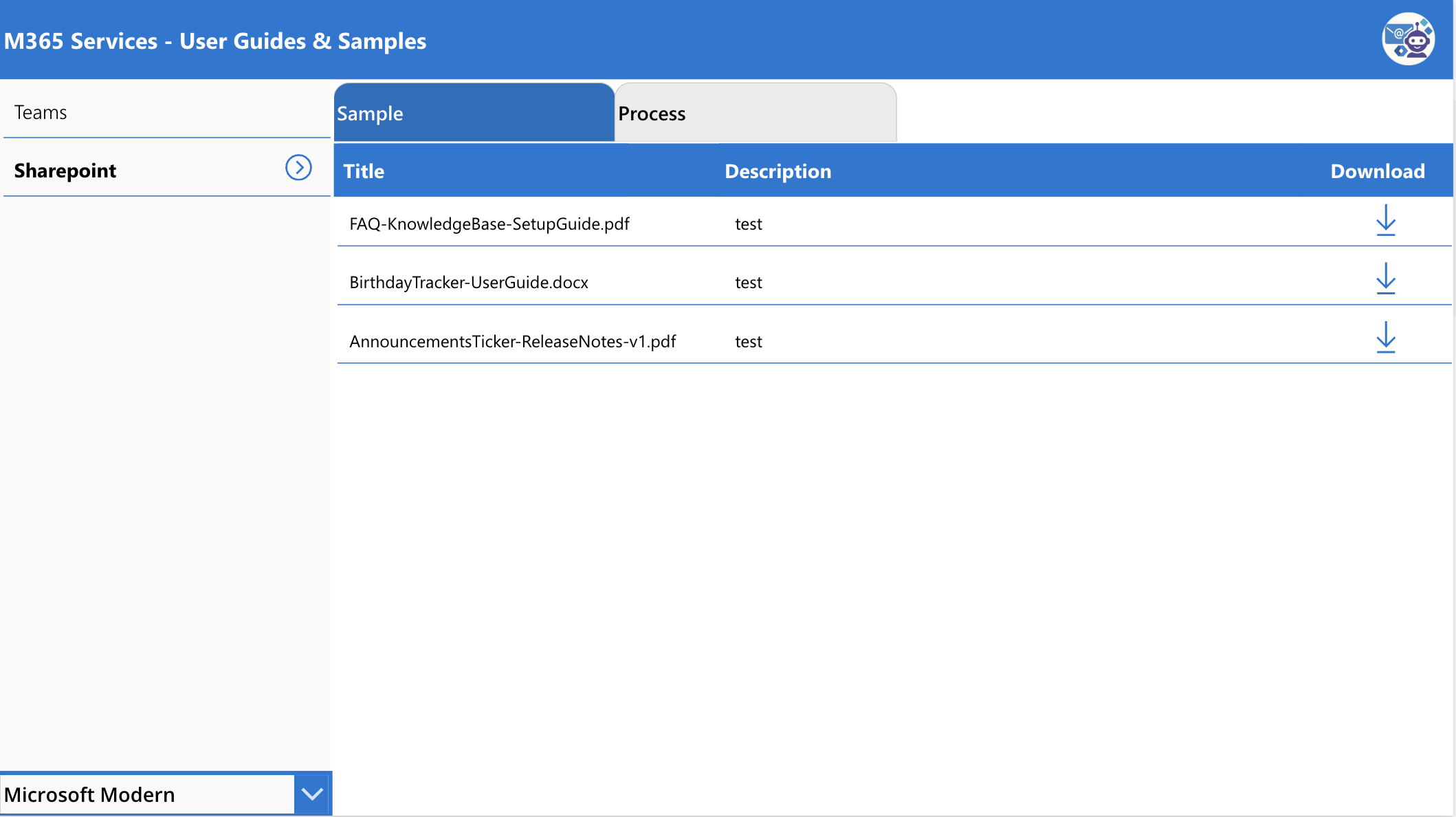
3. Main Screen After Theme Change
After picking a new theme, the entire app rerenders with the new colour palette. Here is the same screen using the Microsoft Modern blue theme, showing how flexible the design is for matching your organisation’s branding.
Walkthrough Video
Here is a short screen recording showing the Power Apps document library in action, including category navigation, sub-category tabs, file downloads, and live theme switching.
Possible Enhancements
The base sample is intentionally simple so you can understand every moving part, but there is plenty of room to grow it into a richer enterprise solution. Here are a few ideas worth considering as a maker:
Track Downloads with Power Automate
When a user clicks the download icon, you can trigger a Power Automate flow that logs the download event into a SharePoint list or Dataverse table. This gives you visibility into which documents are actually being used and which ones are gathering dust.
Send the Download Link via Email
Instead of (or in addition to) a direct download, the flow can email the document link to the requester. This is useful when you want a clear audit trail of who accessed what and when.
Collect Feedback After Download
A follow-up Power Automate flow can send a short feedback request a day after the download, asking the user to rate the document or flag if it was outdated. Over time this builds a continuous improvement loop for your knowledge base.
Pinned and Featured Documents
The library already includes a Pinned column. With a small tweak you can show pinned documents in a highlighted section at the top of the table so important guides always stay visible.
Search and Recently Updated
Adding a global search box and a “recently updated” view makes the app feel even more like a proper portal rather than a static list.
Power Apps Sample Source Code on GitHub
The complete power apps samples as a package, is available on my GitHub repository. Feel free to download it, adapt it to your tenant, and reuse the theming pattern in your own apps. (updated on March 2026)
GitHub Repository:github.com/vishpowerlabs/assets
Get the Enhanced Version
If you would like the enhanced version of this Power Apps document library sample with the full Power Automate integration for download tracking, email notifications, and feedback collection, contact me through the contact form and I will share it with you along with setup instructions.
Final Thoughts
This Power Apps document library viewer is a great example of how a small amount of low-code effort can dramatically improve the everyday experience of finding and using documents in Microsoft 365. The combination of SharePoint as the secure backend and Power Apps as the friendly front-end is hard to beat for internal portals.
But the real lesson in this sample is the discipline of centralised theming and font management. By investing five minutes upfront to define a handful of variables for fonts, sizes, and semantic colours, you save yourself hours of rework every time the brand changes, the design evolves, or a new screen gets added. It is a tiny pattern with an outsized payoff, and it scales from a one-screen utility app all the way up to enterprise solutions with dozens of screens.
Explore More on wrvishnu.com
If you found this Power Apps document library walkthrough useful, you might enjoy some of my other articles on related topics:
If you build something on top of this sample, I would love to hear about it. Drop me a message through the contact form or connect with me on LinkedIn.
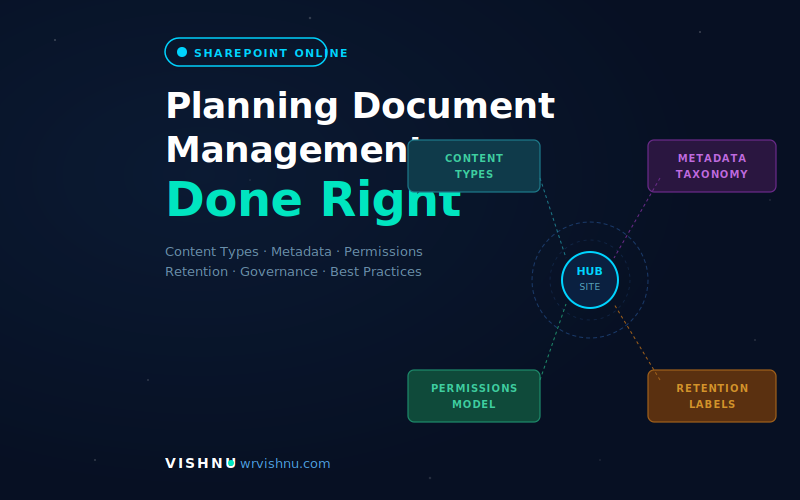
📋 Table of Contents Step 1 — Understand What You’re Solving Step 2 — Design Your Site Architecture Step 3 — Build Your Content Type Hierarchy Step 4 — Design Your Metadata Taxonomy Step 5…
Welcome to This Microsoft 365 Blog This Microsoft 365 blog is run by Vishnu, a Microsoft Solutions Architect and Microsoft Expert working with enterprise-scale M365 environments. Over the years, I have spent countless hours designing,…
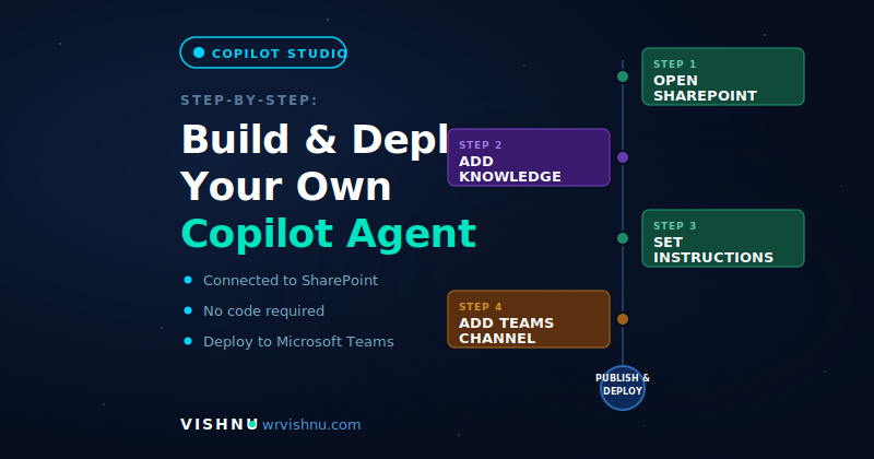
Copilot Studio agent SharePoint integration is one of the most impactful Microsoft 365 productivity wins available today — turning your existing document libraries into an AI-powered knowledge base that your team can query directly from…